I landed on this posting on pronunciation of SQL and related acronymns from the Oracle WTF blog (ridiculing people who deserve it - shame they don't name names!). I happen to agree with the original poster and just "use whatever is easier on my tongue," a philosophy that would stand you in good stead in so many other situations too.
I also tend to adjust my pronunciation in conversation when someone else has used the word, either to the same as them if I like them or to the opposite if they annoy me. So if you start talking about Linn-ux and I say Lie-nux you'd better mind yourself ;-)
Anyway I liked the stylised representation of page views at the bottom of the discussion so much I'll probably steal it:
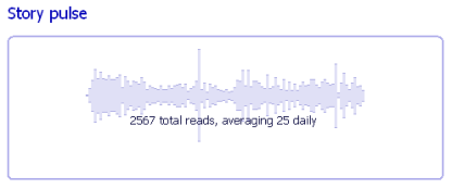
If you want to do the same, please copy the idea and not the implementation. The "pulse" is represented by series of images, one for each day (or whatever period it's broken into). The HTML to make this is 10k and puts the burden of rendering the graph onto each client browser. It's a waste of bandwidth and indeed global processing power! Come on guys, save the planet by generating the image periodically on the server and serving it statically (my PNG above was only 6k including the heading until I had to squish it to fit on this page).
2 comments:
Hi Michael,
yeah, it's a nice idea.
Edward Tufte calls these Sparklines. He's got some nice examples here.
Brian
I love Visual Explanations so I'll be poring over the website and no doubt paying a visit to Amazon shortly!
Post a Comment